For years, the “all-white kitchen” was the undisputed gold standard of interior design. It promised a clean, airy, and “safe” aesthetic that appealed to homebuyers and minimalist enthusiasts alike. But as we move through 2026, a seismic shift is occurring in the heart of the home.
The sterile, clinical look of the past decade is officially being replaced by moody hues, rich textures, and a “quiet richness” that prioritizes personality over resale value.
Here is why the white-out is over and how to embrace the sophisticated allure of the moody kitchen.
1. The Fatigue of Perfection
I used to love the clinical, all-white look, but while setting up my new kitchen, I realized how much work it is to keep clean! I decided to lean into ‘Moody Hues’ because they feel much more grounded and forgiving for a busy daily life.
The primary driver behind the decline of the all-white kitchen is visual fatigue. In an era of high-definition digital lives, stark white spaces can feel flat and uninspiring. Homeowners are moving away from kitchens that look like sterile laboratories and toward spaces that feel lived-in and layered.
The all-white palette, while bright, often lacks the visual warmth needed for a room that has evolved into a multifunctional hub for working, socializing, and cooking. 2026 is the year of the “intentional kitchen”—where every color choice feels like a reflection of the inhabitant rather than a page from a builder’s catalog.
Choice: To start your transition without a full remodel, consider swapping out small appliances for matte finishes.
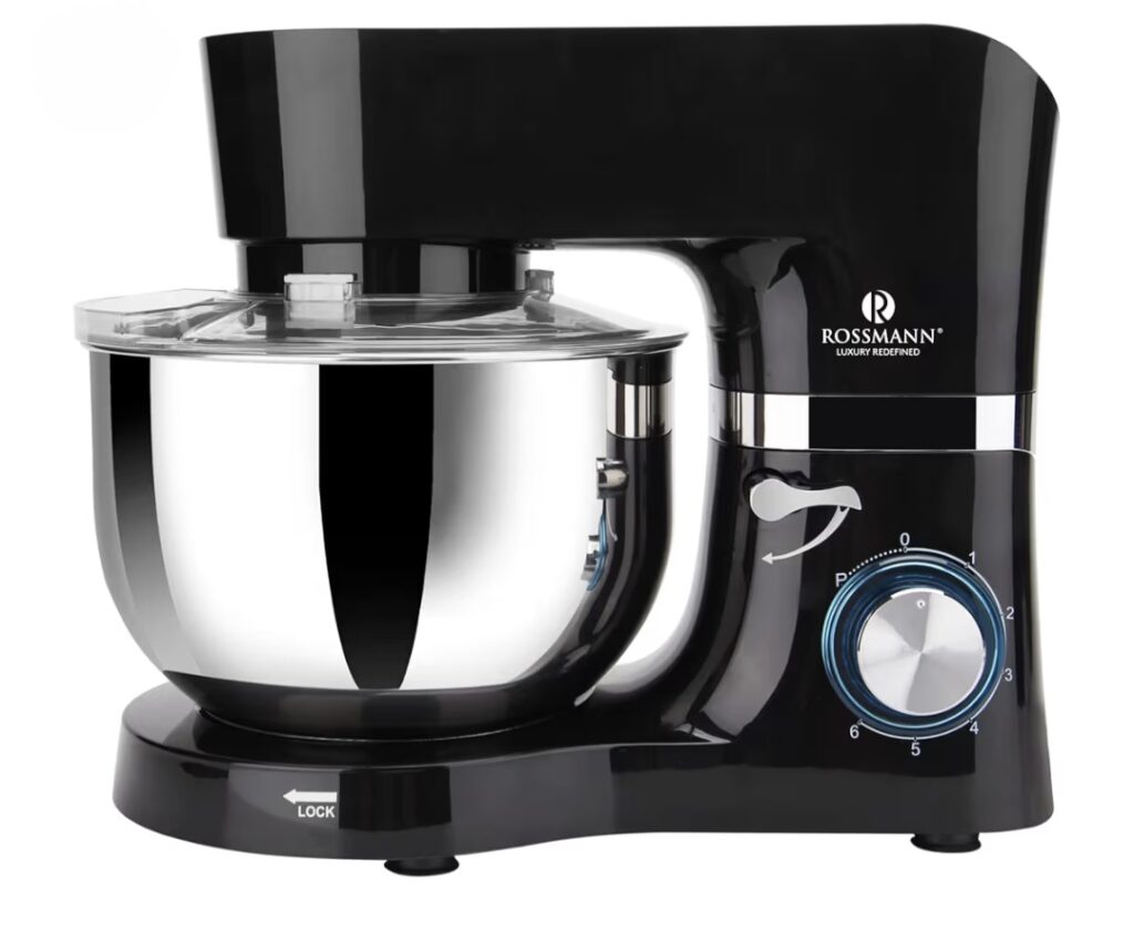
If you are not ready for a full kitchen remodel, swapping out your bright appliances for a premium matte black stand mixer is the easiest way to instantly bring that sophisticated, moody vibe to your counter.
2. The Rise of “Quiet Richness”
Replacing the bright-and-basic look is a trend designers are calling “Quiet Richness.” This isn’t about neon colors or chaotic patterns, it is about deep, grounded tones that create a sense of sanctuary.
Key Moody Hues for 2026:
Smoky Jades & Forest Greens: These shades act as a “new neutral,” bringing a biophilic connection to the outdoors while feeling incredibly sophisticated.
Midnight Blues & Deep Ink: Inky navies offer a tailored, confident presence that pairs beautifully with the aged brass hardware trending this year.
Deep Espresso & Walnut: Rich wood grains are returning, often used for entire cabinet runs to provide a sense of history and permanence.
Burgundy & Plum: For the truly bold, “muddied” reds and purples are making a surprise comeback, offering a soulful warmth that mimics historic European estates.
3. The Psychology of Darker Spaces For Kitchen
I have noticed that after a high-stress day of work, walking into a kitchen with deep, warm tones feels instantly more relaxing. It turns the kitchen from just a ‘cooking station’ into a sanctuary where I can actually unwind.
There is a psychological comfort in darker colors that white simply cannot provide. While white reflects light and creates an illusion of space, moody tones absorb light, creating a “cocooning” effect.
Research into color psychology suggests that deep blues and greens can lower stress levels, making the kitchen a more relaxing environment after a long day. Furthermore, darker palettes are often associated with intimacy and formal entertainment, turning a standard Tuesday night dinner into a more sensory, elevated experience.
4. Mixing Materials: Texture is the New White
In a moody kitchen, the “flatness” of a single color is broken up by a heavy emphasis on texture. Designers are moving away from high-gloss finishes and toward:
Matte Cabinetry: Velvety matte finishes prevent dark colors from feeling overwhelming by absorbing glare.
Natural Stone: Marble with heavy, dramatic veining or honed soapstone replaces the “speckled” quartz of the 2010s.
Mixed Metals: Unlacquered brass, satin bronze, and blackened steel provide the necessary “jewelry” to make dark cabinets pop.
Tip: If you are not ready to commit to a full dark kitchen, try the “Two-Tone” approach. Use a moody hue like charcoal or olive for your base cabinets and island, while keeping the upper walls or shelves in a warm, creamy mushroom tone.
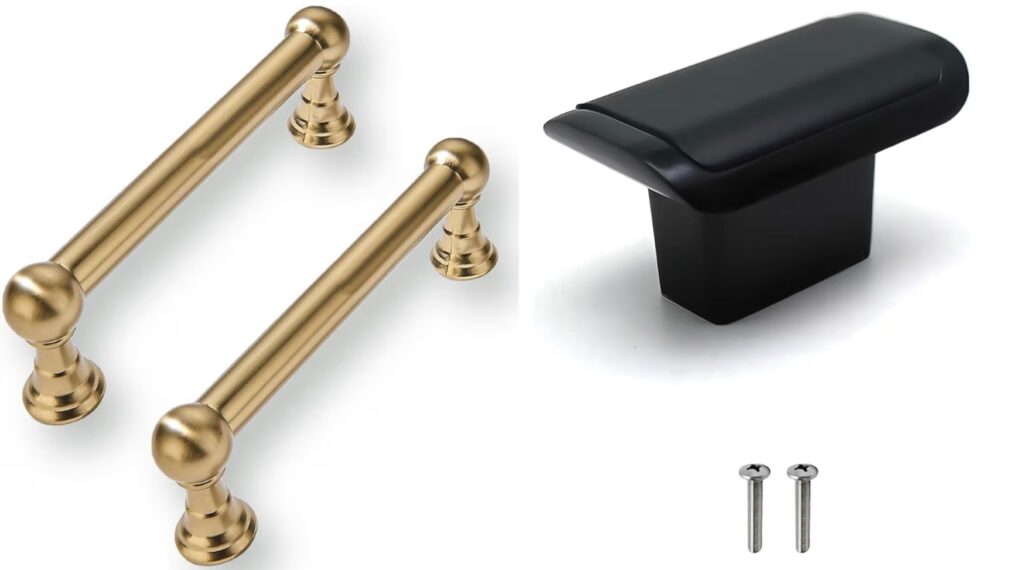
Style Upgrade: Upgrading your cabinet handles is the fastest way to achieve the moody look on a budget.
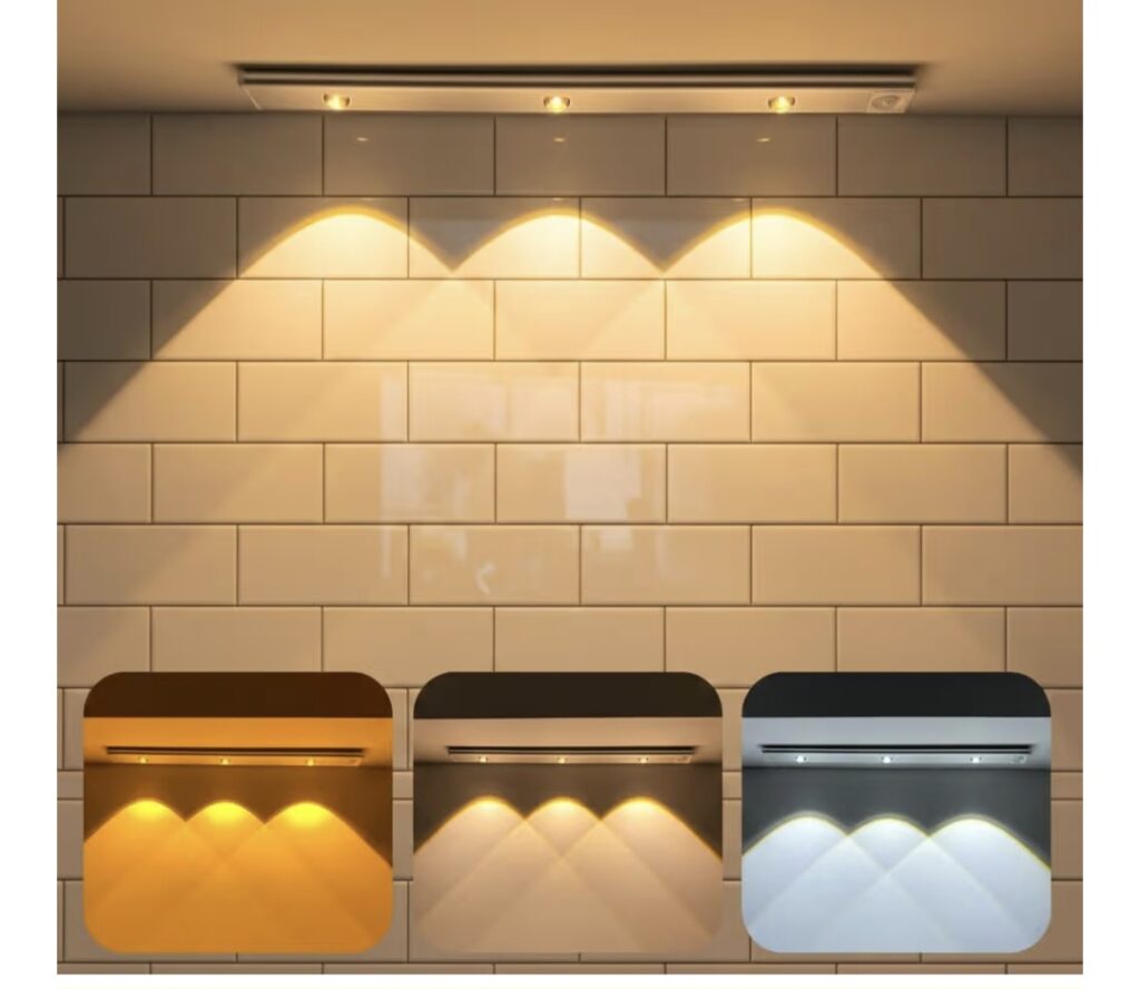
5. Lighting: The Secret Ingredient
The biggest fear homeowners have with moody colors is making the kitchen feel like a cave. The 2026 solution is not to add more white, but to add layered lighting.
Strategic use of under-cabinet LED strips, statement pendant lights over the island, and even small “kitchen lamps” on the countertop can highlight the depth of moody paint colors. When lit correctly, a dark kitchen doesn’t feel small—it feels infinite.
Style: For that high-end look, install motion-sensor under-cabinet lighting.
The transition from all-white to moody hues signifies a shift in how we view our homes. We are no longer designing for the next person who might buy the house, we are designing for ourselves. By embracing the drama of deep greens, blues, and browns, you are creating a space with a soul.
It signifies a fundamental shift in the psychology of homeownership. We are witnessing a “Design Rebellion” where the emotional needs of the current resident are finally outweighing the hypothetical preferences of a future buyer.
When you stop designing for the “next person” and start designing for your own peace of mind, the home stops being a project and starts being a refuge. By embracing the drama of the dark, you are not just following a 2026 trend—you are building a space that feels as deep and complex as the people who live within its walls.